UX & UI Design
When a site looks right and still doesn't convert
A surprising number of B2B sites are handsome and quietly ineffective. They were designed to impress the team that approved them, and they do. What they don't do is guide a busy, sceptical buyer from interest to the next step, because nobody designed the route.
We design for the decision first: what each visitor needs to see, and in what order, to move. The craft is built on top of that.
What is UX and UI design for a website?
UX design is the structure of how someone moves through a page and a site: what they see first, what they're asked to do, and where friction gets in the way. UI design is how it all looks and feels. On a B2B site the order matters, because a clear page that leads somewhere will outperform a striking one that doesn't.
How we work
Before any layout is drawn, each page gets three questions answered: who it's for, what they need to believe, and what they need to see in what order. The design then serves those answers. We design in the build itself rather than in a separate tool, so there's no gap between the version you approve and the one that launches.
Case study: Adfin
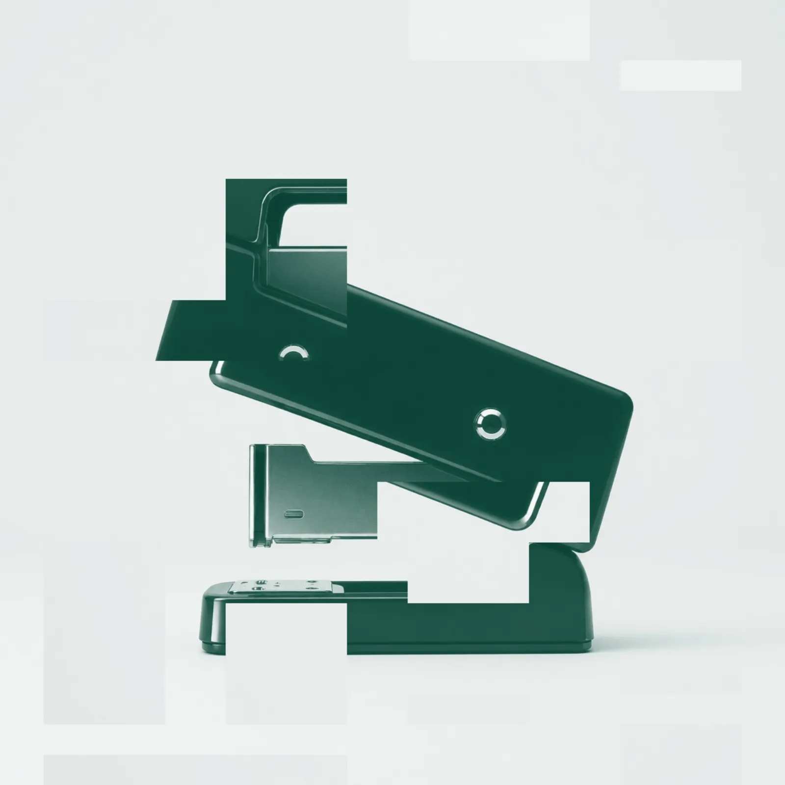
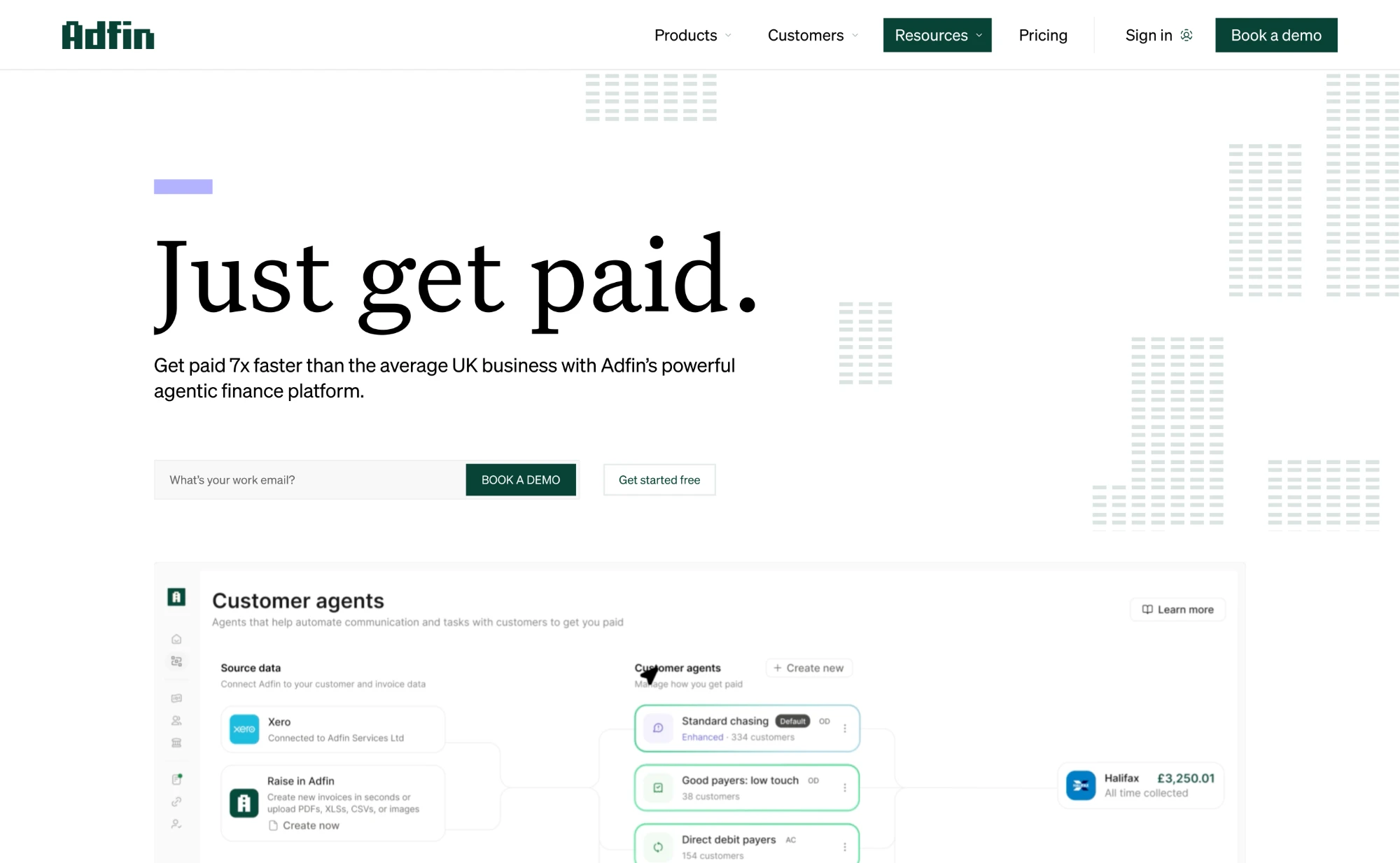
Adfin's hero had to show real product UI, not abstracted animation, because the audience was upmarket and sceptical. The design system used an animated block motif from the logo and a restrained palette, designed in the build so what the founders approved was what launched.
- To launch
- 8 weeks
- Unique page designs
- ~30
What's included
Design work covers page-level UX briefs, wireframes where they genuinely help, visual design in the Webflow build, responsive behaviour across breakpoints, motion where it earns its place, and accessibility built in from the start.
Outcomes
Pages where the next step is obvious, the proof sits where the doubt is, and nothing competes for attention that doesn't need to be there. The site ends up looking good because it's clear.